Color drenching is taking the interior design world by storm, with homeowners embracing the bold strategy of painting their spaces in a cohesive single hue from the ceiling to the floor. This trend, while visually striking, presents unique challenges in functional areas such as the kitchen. Experts warn that implementing a monochromatic scheme in this often-busy hub can hinder efficiency and safety. In this article, we’ll delve into what color drenching truly means, the expert opinions on its application in kitchen design, and provide practical tips on how to brighten your kitchen without sacrificing style or functionality.

Key Takeaways
- Color drenching can enhance aesthetics but may hinder functionality in kitchens.
- Homeowners should prioritize personal style over trends when choosing kitchen colors.
- Incorporating colorful accents and considering lighting are key for a successful color scheme.
Understanding Color Drenching in Kitchens
### Understanding Color Drenching in Kitchens
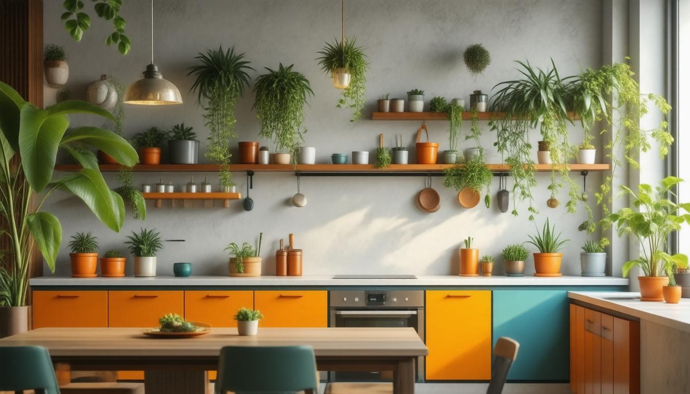
In contemporary interior design, the trend of ‘color drenching’ has gained traction, allowing homeowners to envelop their spaces in a single hue from ceiling to floor. While this approach creates a striking aesthetic, experts caution against applying the same concept in kitchens, especially when it involves matching cabinet colors with wall colors. According to Sue Wadden from Sherwin-Williams, a fully monochromatic kitchen can blur the visual cues essential for efficient task differentiation; this can, in turn, complicate cooking and other kitchen activities.
Blair Britt from Bella B Home Designs advocates for prioritizing personal style over fleeting design trends. Homeowners who love a vibrant, playful atmosphere might find color drenching appealing, but those leaning towards a more traditional aesthetic may benefit from opting for varying tones or incorporating wood cabinetry. To successfully add color to kitchens while maintaining functionality, homeowners can consider design tips like introducing colorful accents in smaller areas such as bar carts or coffee nooks, utilizing splashbacks to break color monotony, or selecting softer tones to preserve an open, airy ambiance.
Lighting plays a crucial role in how paint colors are perceived. Thus, it’s vital to experiment with paint samples under different lighting conditions to find the perfect shades for your space. When choosing colors, particularly for wood cabinets, maintaining a consistent shade of white for both walls and cabinets can prevent color clashes, resulting in a more harmonious environment. Ultimately, when selecting colors for your kitchen, balance personal style preferences with practical needs to create a space that is not only beautiful but also highly functional.
Practical Tips for Incorporating Color in Kitchen Design
To effectively incorporate color into kitchen designs, it’s essential to focus on practical applications that enhance both aesthetics and functionality. One approach is to introduce colorful accents through décor items such as dishware, linens, or wall art, which can add vibrant touches without overwhelming the space. Additionally, creating a color contrast with elements like colored backsplashes or decorative tiles can break the monotony and add visual interest. Homeowners can also consider using painted cabinetry in a hue that complements the overall color scheme, while countertops and flooring remain neutral to balance bold colors. Remember, the choice of colors should reflect personal style but also account for elements like kitchen size and natural light; lighter shades can make a small kitchen feel more expansive while darker tones can create a cozy dining atmosphere. These subtle yet impactful choices lead to a well-designed kitchen that is both inviting and functional.